
Monitoring an ISP Network: SNMP, NetFlow and the Metrics That Matter
The gap between an ISP that looks reliable and one that actually is usually comes down to visibility. Monitoring is not a single product you buy and switch on; it is a set of layers, each answering a different question, each blind to the things the others see. Treat them as one stack and you get the rare combination operators want: outages that are caught before the phone rings, capacity decisions backed by trend data, and a fault map that tells you who is affected the moment something breaks.
The mistake most growing ISPs make is buying one layer and assuming it covers the rest. A device that pings happily can still be dropping every subscriber behind it. An interface graph that looks healthy can hide a single customer being hammered by a flood. This article walks the five layers in the order you should build them, what each genuinely tells you, how each fails in production, and the alerting discipline that keeps the whole thing trustworthy instead of a wall of noise.
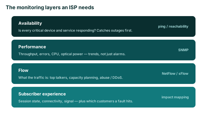
The five layers at a glance
Each layer has a distinct question, a distinct data source, and a distinct failure mode. Build them bottom-up, but understand that no single layer is sufficient on its own.
| Layer | Question it answers | Typical data source | What it misses |
|---|---|---|---|
| Availability | Is it reachable? | ICMP, TCP checks, service probes | Soft failures — up but degraded |
| Performance | How healthy is it, and trending which way? | SNMP polling, streaming telemetry | What the traffic actually is |
| Flow | Where is traffic going and why? | NetFlow, sFlow, IPFIX | Per-device health, optical state |
| Subscriber experience | Is this customer actually online and usable? | RADIUS/AAA accounting, session state | Root cause inside the core |
| Impact mapping | Who does this fault affect? | Topology plus subscriber data | Nothing — it consumes the others |
Availability: is it up?
Start with reachability. Probe every critical device and service and alert when something stops responding — core and aggregation routers, BNGs, upstream links, and the services subscribers cannot live without: DNS, RADIUS, DHCP, and your billing or captive-portal endpoints. This layer is cheap, fast, and catches the majority of hard-down events before customers do.
Its weakness is that reachability is binary and reality is not. A router answers ICMP from its control plane while its forwarding plane silently black-holes traffic. A RADIUS server accepts a TCP connection but rejects every authentication because its database is locked. Availability monitoring reports green through both. That is why it is the floor, not the ceiling — and why service-level checks (does RADIUS actually authenticate a test user, does DNS actually resolve) matter far more than a bare ping.
Performance: SNMP, and why trends beat alarms
SNMP polling is the workhorse of performance monitoring: interface throughput and packet counts, input and output errors and discards, CPU and memory, chassis temperature, and — critically on fiber networks — optical transmit and receive power on every transceiver. Poll these on a steady interval and graph them over weeks, not minutes.
The reason to keep history is that the most expensive failures announce themselves slowly. An uplink creeping from 60 to 85 percent at peak over a month is a capacity decision you want to make on a Tuesday, not an outage you discover on a Friday night. An optic whose receive power drifts down a fraction of a dBm per week is a transceiver or a dirty connector you replace during a maintenance window — long before it crosses the threshold where the link flaps and takes subscribers with it. Alarms tell you something already broke; trends let you fix it before it does. Pair SNMP with active latency and packet-loss probes between key points so you measure the path, not just the boxes on it. For turning these trends into upgrade decisions, see our guide on capacity planning for ISPs.
Flow: where the traffic actually goes
SNMP tells you a link is at 90 percent; it cannot tell you why. Flow telemetry — NetFlow, sFlow, or IPFIX — answers the what: top talkers, top applications, which upstream or peer a flow took, and where a sudden surge originated. This is the layer that turns raw utilisation into decisions.
Flow data drives three jobs at once. For capacity and peering, it shows how much of your traffic could move to a cheaper peering path instead of expensive transit. For abuse and security, a sudden spike of a single traffic type aimed at one customer IP is often the first visible sign of a DDoS — flow detection is the foundation of any mitigation plan, as covered in our DDoS mitigation baseline. For troubleshooting, it answers the recurring evening question of which application or destination just filled an aggregation link. In production, the practical limits are sampling and storage: sampled flow (typical on high-speed interfaces) is excellent for trends and top-N but can miss small, short-lived flows, so do not treat it as a packet-accurate audit log.
Subscriber experience: what the customer actually feels
Device-up and link-green guarantee nothing about a subscriber. The layer customers actually live in is session state: is their PPPoE or IPoE session established, are they authenticated, is their accounting still updating, and on the access side is the connection showing acceptable signal — optical levels on GPON, signal-to-noise on wireless. RADIUS and AAA accounting are the richest source here because they record the real lifecycle of every session.
The payoff is operational. When a customer reports slowness, the ability to pull up their live session — online or offline, current speed profile, last authentication, signal quality — turns a fifteen-minute guessing game into a two-minute diagnosis. Aggregate the same data and patterns emerge: a cluster of sessions dropping together points straight at a failing access node, often before the device itself alarms. This is also where billing and provisioning meet monitoring, since the AAA layer that authenticates sessions is usually the same one that enforces plan changes. For the subscriber side of the picture, see this same monitoring discipline applied end to end.
Impact mapping: who does this fault affect?
The final layer consumes all the others. When a device fails, the question that actually matters to the business is not what failed but who it took down — how many subscribers, which areas, and whether any are priority or enterprise accounts. Answering that instantly requires linking your monitoring to topology and subscriber data so a single failed OLT or aggregation switch immediately resolves to a list of affected customers.
This is the difference between watching graphs and running an ISP. With impact mapping, an outage becomes a scoped, communicable event: support can proactively notify affected customers, field teams are dispatched to the right node, and management sees revenue impact in real numbers. Tying live network status to subscriber and topology records is exactly what a network map is for. Without it, every fault starts with the same slow, anxious question: who is calling, and are they all connected to the same thing?
Alerting discipline: trust the pager
More monitoring is not more dashboards; it is faster, calmer decisions. The fastest way to ruin a good stack is alert fatigue — when on-call stops trusting the pager, your mean-time-to-respond quietly collapses. A few principles keep alerting honest:
- Alert on symptoms, not every metric. Page on subscriber-affecting conditions, not on a CPU spike that self-resolves in thirty seconds.
- Use severity tiers. Separate wake-someone-up events from review-in-the-morning events, and route them differently.
- Suppress dependent alerts. When an upstream device dies, do not also page for the fifty things behind it that just went unreachable — alert on the root, suppress the rest.
- Keep enough history to see trends and to justify capacity spend with data instead of anecdotes.
How to choose and common mistakes
Build the layers in order — availability first, then performance, then flow, then subscriber state, with impact mapping stitching them together as your topology data matures. Do not skip ahead to fancy flow analytics while your service checks are still bare pings. The most common mistakes are predictable: relying on ICMP alone and missing soft failures; collecting SNMP but never keeping enough history to see trends; deploying flow but ignoring its security value; and — the costliest of all — never connecting any of it to who is affected, so every outage is rediscovered from scratch through the support queue.
The takeaway
An ISP monitoring stack is five questions, not one tool. Availability tells you something is reachable; performance tells you it is healthy and which way it is trending; flow tells you what the traffic is; subscriber telemetry tells you what customers actually feel; and impact mapping tells you who a fault affects. Each is blind without the others. Build them as one connected system, alert with discipline, and you turn outages into contained, communicable events and capacity planning into a routine you control. Want to see live network state tied directly to subscribers and topology? Take a look at ISP Digital.